DIT RECORDS
DESCRIPTION
Apparel Promotion OEM/ODM — Brand Website
DURATION
Sep 2026
MY ROLE
- Brand art direction — seven reference teardowns, a consolidated direction deck, five main concepts narrowed to one.
- Four-page responsive Next.js frontend with the main intro interaction.
- Inquiry form, Supabase storage and a private admin page.
- Responsive, accessibility and Korean SEO work.
- Vercel deployment, domain connection preserving the existing mail MX, health endpoint and uptime monitoring, design intent document.
TECH
Next.js 16 (App Router) · React 19 · TypeScript · Tailwind CSS v4
CSS 3D sleeve flip · IntersectionObserver reveal · Lenis
Supabase (Postgres, Auth)
Vercel · Self-hosted Pretendard Variable · Health endpoint + uptime monitor
Project Purpose
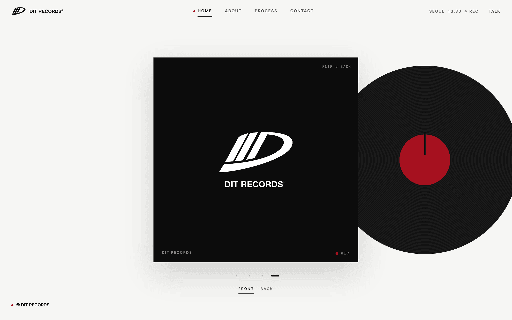
"A record label, for clothing." DIT RECORDS is an apparel promotion house — OEM and ODM for other brands — and this is its first website. The brief was almost entirely subtractive: no production photography to speak of, and a client request for nothing more than clean type. So the site was built around what the company already said about itself. The LP sleeve, SIDE A : ODM / SIDE B : OEM, and DANCING IN THE RECORDS were not adopted as a metaphor after the fact; they were already in use, and the page structure simply followed them. The entire interaction budget sits in the main intro, where a black sleeve delivers the brand message in four beats before flipping and turning, and the other three pages share one reveal component so the restraint reads as a system rather than a shortage.
Background & Challenge
DIT RECORDS manufactures apparel for other brands — promotional OEM and ODM — and had never had a website. Two conditions shaped everything. There was almost no usable photography of the production floor, and the client's only stylistic instruction was "clean type", with custom cursors, blur, glow, particles, scroll-jacking and parallax named as things they did not want. That removes the two moves a fashion production site normally leans on: large imagery, and motion used as atmosphere. What the company did already have was a vocabulary — it calls itself a record label for clothing, splits its services into SIDE A : ODM and SIDE B : OEM, and titles its own deck DANCING IN THE RECORDS. The job was not to invent a concept but to translate one that already existed into page structure.
Scope
- · Brand Art Direction — 7 Reference Teardowns, Direction Deck, 5 Main Concepts
- · 4-page Responsive Frontend (MAIN · ABOUT · PROCESS · CONTACT)
- · Main Intro Interaction — 4-beat Brand Message, Sleeve Flip & Turn
- · Inquiry Form, Supabase Storage & Private Admin Page
- · Deployment, Domain, Health Endpoint & Uptime Monitoring
Key Technical Features
One Intro, Four Beats
- · On a black LP sleeve the message runs slogan → definition → figures → logo, and closes with two movements: the sleeve flips, then turns. Track figures count up as they enter the viewport.
- · Putting the interaction in one place was a decision, not a budget. A different device on every page makes a four-page site read as four sites, so the other three pages share a single IntersectionObserver reveal component.
What the Site Declines to Do
- · Custom cursor, blur, glow, particles, scroll-jacking and parallax are all absent — named by the client as things to avoid. Transitions are held to 150–300ms throughout.
- · With those removed, hierarchy has to come from type size, plane and spacing. The dominant tone is switched per page instead: MAIN white with a black sleeve, PROCESS entirely black, ABOUT a wide left sentence against right-hand body copy, CONTACT the strongest accent.
Inquiry Form With a Meeting Date
- · Five fields — brand, contact name, phone, message and requested meeting date — plus consent. Asking for the date in the form removes one round trip from the first reply.
- · Submissions land in Supabase and are read on a private admin page. A KakaoTalk floating button opens a second route for visitors who will not use a form at all.
Hydration Checked as a Matrix
- · On a return visit the active header item could resolve differently on the server and the client. It only appeared under a specific combination, so it was reproduced across desktop/mobile × first visit/return × throttled × four pages rather than by repeated reloading.
- · Lighthouse on desktop came out at 99 performance and 100 for accessibility, best practices and SEO, verified across six browser combinations.
Self-hosted Korean Type
- · Pretendard Variable is served from the app rather than a font CDN, so the first paint does not swap faces a beat after the page arrives.
- · After the domain was connected, a health endpoint and an external uptime monitor were added so downtime is reported rather than discovered.
Design Points
THE RECORD
A fashion production site carried by type and plane instead of photography. Sleeve, tracklist and SIDE A/B are used as they are, because the company was already using them — the site reads as a translation rather than a rebrand.
Three Colours
Off-white ground (#F6F6F4), black sleeve and DEEP RED (#A6111F). The accent is allowed on one mass per screen, which is what keeps a red that saturated from turning into decoration.
The REC Blink
A deep red dot blinks on a 1.2s step, like a recording indicator. It stays beside the logo on every page — the one moving element in a site that otherwise holds still.
A Dominant Tone Per Page
MAIN is white with a black sleeve, PROCESS is black edge to edge, ABOUT runs a 60px left sentence against a narrow right column, CONTACT carries the strongest accent. The pages differ by weight of plane, not by effect.
Four Photographs, Cropped
The client later supplied factory photography; four frames were cropped to black and white and placed in the PROCESS band and the ABOUT wide only. Enough to prove the floor exists, not enough to break the tone.
Outcome
- Scope
- 4 pages (MAIN · ABOUT · PROCESS · CONTACT) · main intro interaction · inquiry form & admin
- Duration
- About one month, launched Sep 2026
- Lighthouse (desktop)
- Performance 99 · Accessibility 100 · Best Practices 100 · SEO 100
- Verification
- Chromium/WebKit × desktop/mobile — 0 console errors, 0 horizontal scroll
The site launched with the whole interaction budget concentrated in one intro and the remaining pages sharing a single reveal component, which is what kept a four-page build from reading as four different sites. A hydration mismatch that could pick the wrong active header item on a return visit was reproduced through a desktop/mobile × first-visit/return × throttled × four-page matrix and fixed before launch. After the domain was connected, a health endpoint and an external uptime monitor were left in place.
Gallery
Click to enlargeFAQ
How is a 3D interactive website different from a regular one?
It runs Three.js and WebGL in the browser, so objects move and respond to the cursor and scroll. A regular site organises information; an interactive one delivers the brand as an experience. It pays off most in fashion, beauty, architecture and exhibitions.
How long does a website take to build?
Seven days for a landing page, fifteen for a five-page company site, thirty for a ten-page 3D interactive build. The clock starts when your material arrives and shifts with design feedback. If a date is fixed, say so at the first call and feasibility is checked first.
Are hosting, domain and server costs separate?
SSL certificate, hosting setup and database provisioning are included at no cost. You only pay for the domain, about ₩20,000–30,000 a year. Accounts are created in your name from the start, so nothing lapses when staff change.
Can I edit the content myself after launch?
An admin page is built alongside the site, so text, images and posts can be edited without development knowledge, and a manual is handed over at delivery. Only structural changes or new features need development.