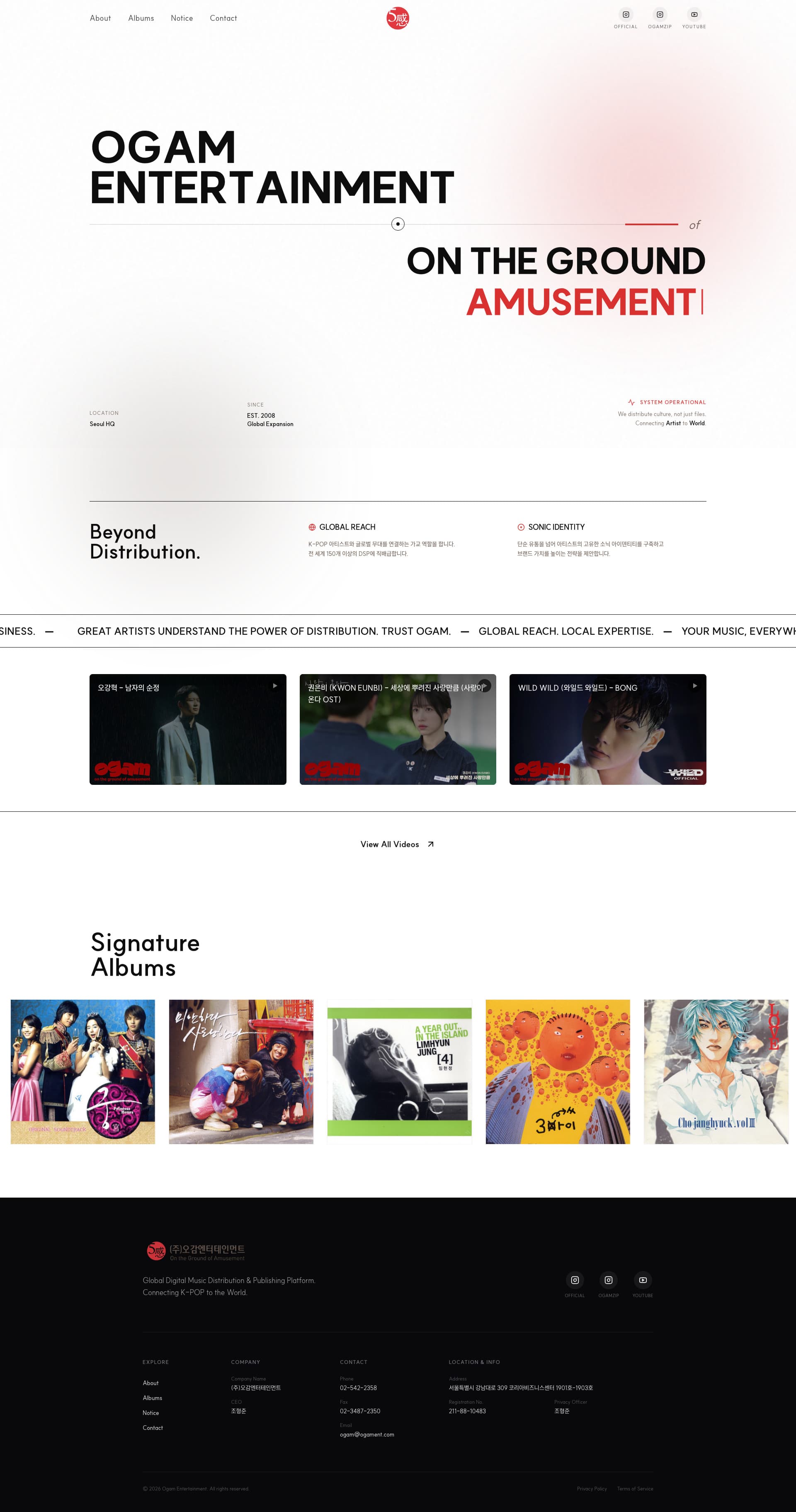
Ogam Entertainment

DESCRIPTION
Music Distribution — Corporate Website
DURATION
Feb 2026
MY ROLE
- Full website planning and UI/UX design aligned to the entertainment brand identity.
- Scroll-based interaction and frontend dynamic animation implementation.
- Album and music video content management structure, with mobile-optimised responsive development.
TECH
Modern frontend stack · Custom layout
Scroll animation · Kinetic typography
Project Purpose
"We distribute culture, not just files." Ogam Entertainment distributes K-pop directly to more than 150 DSPs worldwide. A standard B2B template would have been accurate and useless — the company sits inside an industry that trades on taste as much as logistics. The site was built to hold both: enough rhythm and visual energy to read as music-adjacent, enough structure to satisfy a partner evaluating a distribution deal.
Scope
- · Corporate Website UI/UX Planning & Design
- · Responsive Frontend Development
- · Dynamic Scroll Interaction & Animation
- · Media Archive Structure — albums & music videos
Key Technical Features
Kinetic Typography & Animation
- · A marquee animation running across the screen — "GREAT ARTISTS UNDERSTAND THE POWER…" — gives the whole site a musical pulse.
- · Motion is used as tempo rather than decoration.
Interactive Media Showcase
- · A horizontal scroll-to-explore UI in Latest Releases lets a large catalogue of album art be browsed as a gallery without fighting for vertical space.
- · A custom slider foregrounds music videos and release news.
Structured Service UX
- · Global distribution, data analytics, publishing and marketing are numbered and set on an intuitive grid.
- · For a B2B partner, the four-service overview is the part that has to be unambiguous.
Performance & Responsive Optimization
- · Rendering was optimised for a page loading a large volume of high-resolution album artwork and media.
- · Animation-heavy sections were tuned to run without frame drops on mobile.
Design Points
Trendy & Sonic Identity
A dark base with high-contrast type and deliberate whitespace produces the polish the entertainment industry expects. Font weight and placement were worked until the brand philosophy — distributing culture, not files — reads visually before it is stated.
Immersive Layout
A full-bleed layout using the entire browser width expresses the scale and openness of a global distribution business.