84A
DESCRIPTION
Second-hand Clothing Curation Shop — Cafe24 Custom Storefront
DURATION
Aug 2026 — Sep 2026
MY ROLE
- Information architecture, art direction, per-screen concepts and a design intent document.
- Full Cafe24 Smart Design skin customisation, listing and detail display logic, board customisation, responsive build.
- Member and order screen retone.
- Product categories, board, shipping policy and store settings; initial product registration; pre-launch QA.
- Admin usage guidance and a NOTES writing guide as handover.
TECH
Cafe24 Smart Design (proprietary template syntax)
HTML5 · CSS3 · JavaScript
Design FTP · Git (skin version control) · Live-server verification loop
Primary domain · robots · sitemap · Search-engine ownership verification
Project Purpose
"The same piece never comes back." 84A is a curation shop for second-hand clothing, sold one piece at a time. That changes what a listing has to do: with nothing repeating and no size chart to fall back on, material, condition and price cannot wait for the detail page or hide behind a hover — they belong on the list itself. Alongside it sits NOTES, a journal where the reason for picking each piece is written out, so a visitor can go from seeing the garment to checking its condition to reading why it was chosen without leaving the thread. Cafe24 keeps payment, orders and membership; everything visible was rebuilt from the base skin, down to the login and my-page screens that usually stay in their default state.
Background & Challenge
84A sells second-hand clothing, picked one piece at a time. That single fact breaks the assumption every storefront template is built on: that a product comes back, that a size chart applies, that a thumbnail plus a price is enough. Here the same garment never returns, so what a buyer needs before clicking is material, condition and measurements — and in a default skin all three of those live on the product detail page, or behind a hover. The store runs on Cafe24, which was kept for payment, orders and membership. Everything visible was rebuilt. The constraint that shaped the work is that Smart Design has its own template syntax and will not render locally: the 561 files of the base skin were pulled down over FTP as a version-control baseline, and every change was verified on the live server with the shop held private until launch.
Scope
- · Information Architecture & Art Direction
- · Full Cafe24 Smart Design Skin Customisation (6 Screen Groups)
- · Listing Display Logic — Material, Condition & Price Always Visible
- · NOTES Journal on the Cafe24 Board, With a Writing Guide
- · Member & Order Screen Retone
- · Category, Board, Shipping Policy & Launch Setup
Key Technical Features
The Skin, Not a Theme
- · Cafe24 Smart Design uses its own template syntax and does not render locally. The 561 files of the base skin were pulled over FTP to create a version-control baseline, and the work ran as a loop of uploading to the live server and verifying there.
- · Main, item list, product detail, board, ABOUT and the shopping guide were replaced screen by screen, and the product tile and listing display logic were rewritten rather than restyled.
Information Before Interaction
- · The structure where a thumbnail only reveals its details on hover was dropped: name, material and price are always on screen. In a shop where every piece is different, that is simply faster to scan.
- · Condition and measurements are treated as primary copy rather than fine print, because they are the two things a second-hand buyer decides on.
NOTES — A Journal the Client Writes
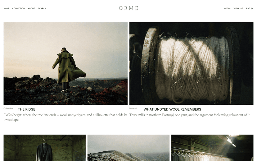
- · The Cafe24 board was customised into a journal with its own prefixes, so the operator posts from the admin and it comes out in the site's tone without touching markup.
- · A separate writing guide was produced and handed over, because a journal that only the developer knows how to format stops being updated.
Member and Order Screens in the Same Tone
- · Login, sign-up, ID and password recovery, my page and profile editing were all brought over rather than left in the default skin.
- · Commerce loses its impression on exactly these screens. A storefront that is careful on the main page and generic at checkout reads as a template with a good cover.
Launch Setup
- · Product categories, boards, shipping policy and store information were configured, and the initial products registered.
- · Primary domain connection, robots restoration, sitemap tidy-up and search-engine ownership verification were completed before opening — the shop was held private throughout the build.
Design Points
Placed Like Still Life
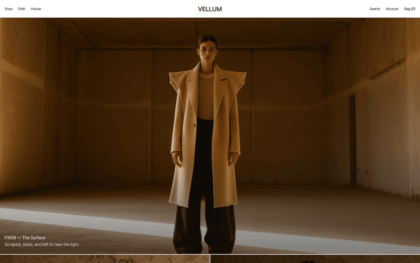
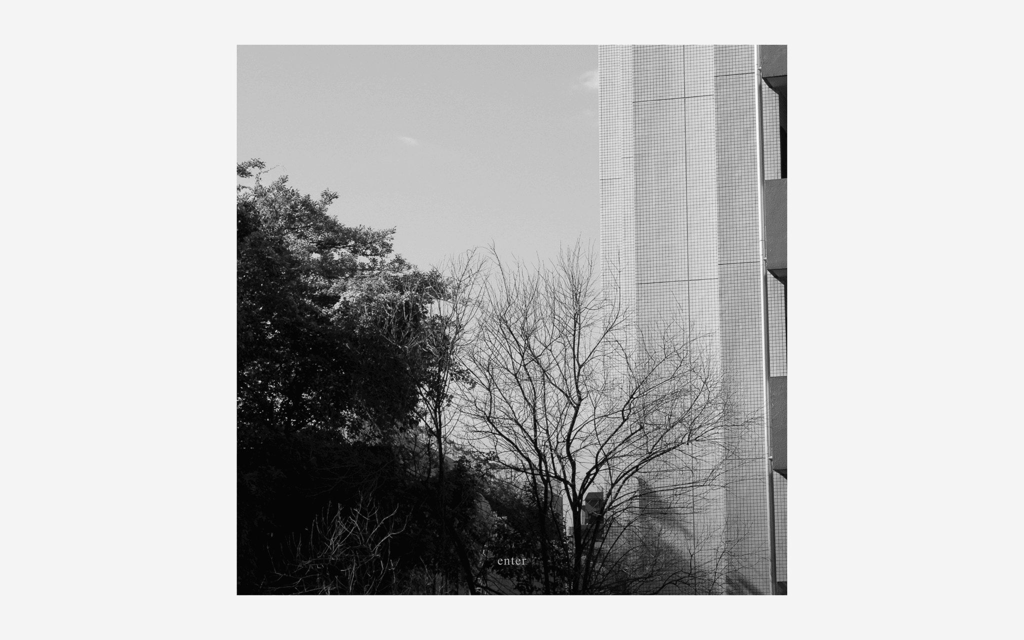
The clothes are not enlarged the way an advertisement would enlarge them. Generous space around each piece makes it read as one object that was put there, which is the same claim the shop makes about how it buys.
Type and Rules Only
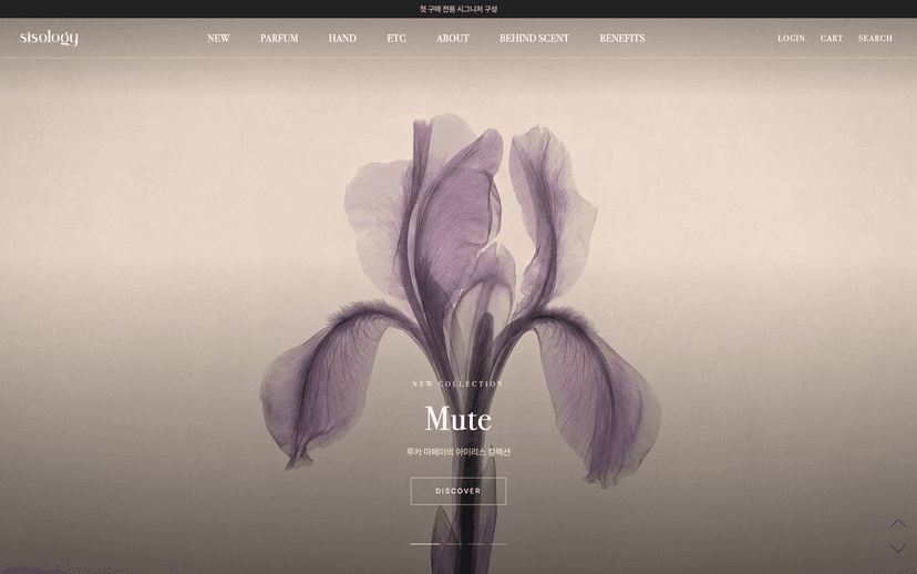
Hierarchy is built from type size and thin rules, with no decorative elements. For second-hand curation, elaborate styling actively subtracts from trust — it suggests the presentation is doing work the garment cannot.
List → Detail → NOTES as One Thread
Seeing the piece, checking its condition and reading why it was chosen run in that order without a break in the path. The journal is not a blog bolted to the side; it is the third step of the same sentence.
Responsive by Density, Not by Breakpoint
Column counts and type sizes were re-fitted per range so desktop, tablet and mobile read at the same density. Scaling a desktop grid down keeps the layout and loses the legibility.
Outcome
- Scope
- Main · ITEMS list · product detail · NOTES · ABOUT · shopping guide + member and order screens
- Duration
- About four weeks from confirmed receipt of materials
- Baseline
- 561 base skin files pulled over FTP and placed under version control
- Launch setup
- Categories, board, shipping policy, primary domain, robots, sitemap, search-engine verification
The storefront opened with the listing itself carrying material, condition and price, a NOTES journal the operator writes in from the Cafe24 admin, and the member and order screens brought into the same tone as the rest of the shop. Because the skin sits in version control, later changes are diffed rather than re-uploaded blind — which is the part that usually goes missing on a builder-based storefront.
Gallery
Click to enlargeFAQ
How is a 3D interactive website different from a regular one?
It runs Three.js and WebGL in the browser, so objects move and respond to the cursor and scroll. A regular site organises information; an interactive one delivers the brand as an experience. It pays off most in fashion, beauty, architecture and exhibitions.
How long does a website take to build?
Seven days for a landing page, fifteen for a five-page company site, thirty for a ten-page 3D interactive build. The clock starts when your material arrives and shifts with design feedback. If a date is fixed, say so at the first call and feasibility is checked first.
Are hosting, domain and server costs separate?
SSL certificate, hosting setup and database provisioning are included at no cost. You only pay for the domain, about ₩20,000–30,000 a year. Accounts are created in your name from the start, so nothing lapses when staff change.
Can I edit the content myself after launch?
An admin page is built alongside the site, so text, images and posts can be edited without development knowledge, and a manual is handed over at delivery. Only structural changes or new features need development.