/
2026Menswear — D2C Store Rebuild

MORVIK

MORVIK

DESCRIPTION

Menswear — D2C Store Rebuild

DURATION

Mar 2026 - May 2026

MY ROLE

  • Full rebranding and design system rebuild on the Cafe24 platform.
  • Responsive PC/mobile frontend optimisation and custom script (JS/CSS) work.
  • Commerce taxonomy setup and payment/shipping system integration.
  • External review platform migration and consolidation of scattered reviews.

TECH

Platform

Cafe24

Frontend

JavaScript · HTML · CSS

Design

Figma

Project Purpose

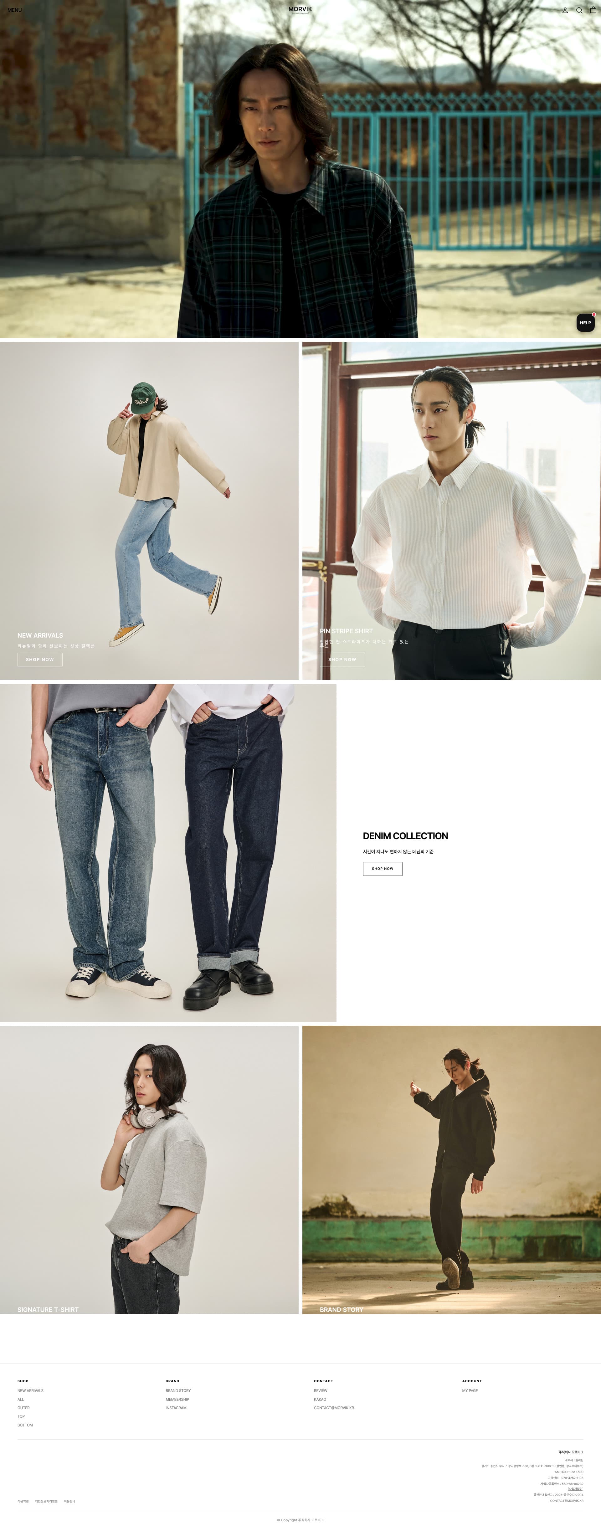
"For ordinary people." MORVIK is a menswear label mid-transition out of its previous identity, HNPP. The brief was a complete rebrand carried through a Cafe24 storefront: redefine the identity, rebuild the store around it, and keep the same restrained tone reading consistently on desktop and mobile. The interesting part of the work is what the platform does not allow — the gap between a stock commerce solution and a brand-grade one was closed by hand.

Scope

  • · Full Rebranding on Cafe24 Storefront
  • · Complete Design Replacement
  • · Custom Script Injection (video & slider UI)
  • · Review Migration & Consolidation

Key Technical Features

Cafe24 Custom Script Injection

  • · Video playback and image sliders are not offered by the stock Cafe24 solution; both were implemented directly through injected JavaScript.
  • · Platform constraints were treated as a starting point rather than a ceiling — the storefront behaves like a custom build while staying on the client's existing infrastructure.

Review Migration & Consolidation

  • · The full review history accumulated under HNPP was migrated onto MORVIK via an external review platform.
  • · Reviews previously scattered across channels were consolidated into one, so social proof survived the rebrand instead of resetting to zero.

Commerce UI Architecture

  • · A NEW ARRIVALS / ALL / OUTER / TOP / BOTTOM taxonomy with sorting by newest, price and review count.
  • · Shopping flow designed so that browsing depth never costs the customer their place.

Design Points

Brand Identity Refresh

Moving from HNPP to MORVIK, a restrained dark palette of black, grey, ivory and forest green establishes the weight and minimalism the menswear category expects.

Mobile-First UX

Built around the reality that this store is shopped on a phone — responsive layout, a recently-viewed product slider, and a KakaoTalk chat CTA placed where a thumb already is.

View ProjectView Website

Next Project

Charcoal

Design Marketplace — AI Platform

Keep scrolling