ORME
DESCRIPTION
Fashion House — D2C Commerce
DURATION
Aug 2026 - Sep 2026
MY ROLE
- Brand planning — naming, line structure and a 32-piece catalogue with pricing.
- Typographic system and design tokens — an 11px scale with hierarchy carried by whitespace.
- Full frontend build — five screens on a shared shell, filter state held in the URL.
- Visual art direction and production — base frame, 44 frames, normalisation pipeline.
- Identity — three logo routes, wordmark selection, favicon.
- Cross-browser verification tooling and deployment.
TECH
Vite 5 · React 18 · TypeScript 5 · React Router 6
Generative image production · ImageMagick
Playwright (cross-browser QA) · Node scripts
Vercel
Project Purpose
"An orme is an elm. It was never built to stand." ORME is a Paris house working in unisex contemporary ready-to-wear. Orme is the French word for elm — a tree that spreads wide and low and takes a shape nobody drew for it. The name describes what the clothes are meant to do: settle into a form rather than be forced into one. The collections are named after terrain rather than after a season. The brief was a storefront with no builder underneath it — nothing inherited from Cafe24 or Imweb, which meant every convention had to be decided rather than accepted.
Background & Challenge
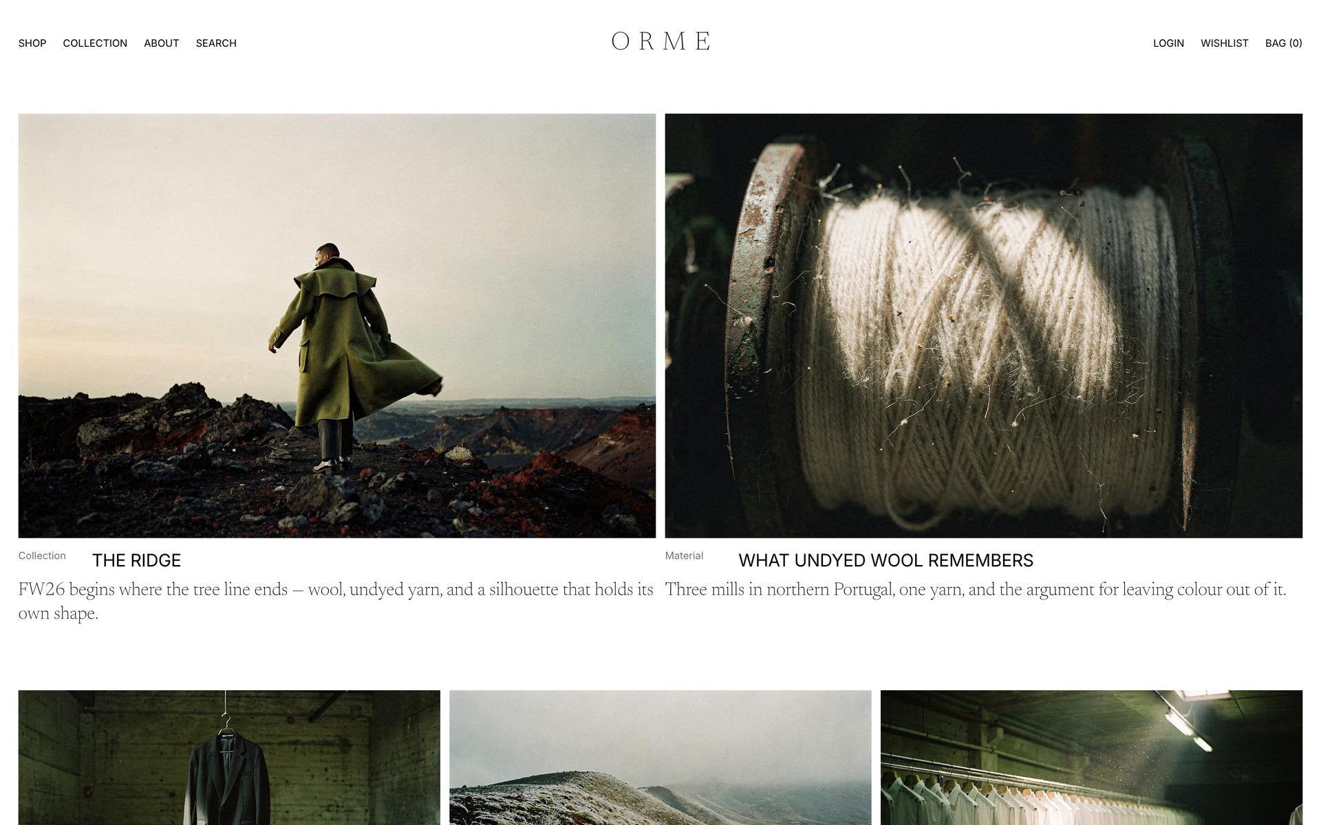
A fashion storefront fails in one of two ways: the layout shouts over the clothes, or it is so plain that ordinary photography looks like a mistake. The system was set to solve both at once. Body type sits at a single 11px across every screen and hierarchy is carried by whitespace and capitals rather than size, which keeps the interface quiet enough for the photography to be the loudest thing on the page. Product shots are letterboxed onto white at a fixed 2:3 so nothing is ever cropped, and that one rule is what makes thirty-two unrelated garments hold together as a grid.
Scope
- · Brand Planning & 32-Piece Catalogue
- · Typographic System & Design Tokens
- · Commerce Shell — PLP, PDP, Editorial Templates
- · Lookbook Production Pipeline
- · Identity, Cross-Browser Verification & Deployment
Key Technical Features
A System Built Around Quiet Type
- · Body type is 11px/15px on every screen — navigation, product cards, specifications and price all share one size. Hierarchy comes from whitespace and capitals instead, so nothing competes with the photography.
- · Only two things are allowed to be large: the editorial serif that anchors the home page, and the single black call to action on a product page. Everything else stays at the base size, which is what makes those two read as decisions rather than decoration.
- · Product images are letterboxed onto white at a fixed 2:3 and never cropped. Thirty-two garments of different shapes and lengths therefore sit in the grid without any one of them breaking the rhythm.
A Commerce Shell With No Backend
- · Login, bag, wishlist, newsletter and search are all absorbed by a single notice component. The copy is written as a calm announcement in the brand's voice rather than an error, so the storefront never has to apologise for what is not open yet.
- · Every filter and sort lives in the query string, which makes any state linkable — a category, a line, a colour, a price order. Scroll restoration was deliberately bound to pathname changes only, so filtering never throws the reader back to the top.
- · The detail page stacks its images vertically instead of running a carousel. Nothing to click means nothing to break, and the full look is visible in one scroll rather than three taps.
One Base Frame, Thirty-Two Garments
- · Producing 32 looks independently gives 32 different people in 32 different rooms. Instead one base frame was fixed first — model, background, crop and lighting — and every subsequent frame was generated against it with only the garment changed.
- · The prompt builder reads the product catalogue directly, so the catalogue is never maintained in two places. Adding a product adds its frame.
- · Two findings shaped the art direction: the crop had to sit at mid-thigh with the face large and frontal rather than full-length, and naming a city anywhere in the brief quietly overrode the casting, so the location had to leave the prompt entirely.
Pipelines Instead of Handwork
- · Normalisation runs through ImageMagick — originals are letterboxed onto white at 1000x1500 for product and 1400x933 for editorial, never cropped, with the filename acting as the route into the site.
- · The product grid pulls 32 images at once, so a card-only 600x900 variant is generated alongside each original. List-page transfer fell from 8.7MB to 2.5MB with no visible difference.
- · Verification is a script: three engines, seven widths from 320 to 2560, six pages, collecting console errors, horizontal overflow and failed image loads. 126 checks, zero findings at deployment.
Design Points
No Products on the Home Page
The grid lives only in Shop. The home page is entirely editorial, and one large serif block near its centre does the work of a hero. A storefront that opens with a wall of product asks to be compared on price; one that opens with a photograph asks to be read.
Documents on a Twelve-Column Asymmetry
A single centred column only makes a page longer. The title runs across nine columns, the lede is pushed right to leave air on the left, and the body folds into two columns beside a label that stays put as you read.
A Serif Wordmark
Three routes were drawn — serif wordmark, grotesque wordmark, and a ridge mark inside a circle — and compared on white and black from 54px down to favicon size. The serif won because it shares its face with the large editorial type, so masthead and body read as one object.
Outcome
- Screens
- 5 (home, shop, product, collection, about)
- Catalogue
- 32 pieces across 5 categories, 3 lines
- Imagery
- 44 frames produced in-house
- Verification
- 126 checks across 3 engines and 7 widths
The visual production and the cross-browser verification both run as scripts rather than by hand, so the catalogue and the QA pass can be regenerated whenever the season changes.
Gallery
Click to enlargeFAQ
How is a 3D interactive website different from a regular one?
It runs Three.js and WebGL in the browser, so objects move and respond to the cursor and scroll. A regular site organises information; an interactive one delivers the brand as an experience. It pays off most in fashion, beauty, architecture and exhibitions.
How long does a website take to build?
Seven days for a landing page, fifteen for a five-page company site, thirty for a ten-page 3D interactive build. The clock starts when your material arrives and shifts with design feedback. If a date is fixed, say so at the first call and feasibility is checked first.
Are hosting, domain and server costs separate?
SSL certificate, hosting setup and database provisioning are included at no cost. You only pay for the domain, about ₩20,000–30,000 a year. Accounts are created in your name from the start, so nothing lapses when staff change.
Can I edit the content myself after launch?
An admin page is built alongside the site, so text, images and posts can be edited without development knowledge, and a manual is handed over at delivery. Only structural changes or new features need development.