VELLUM
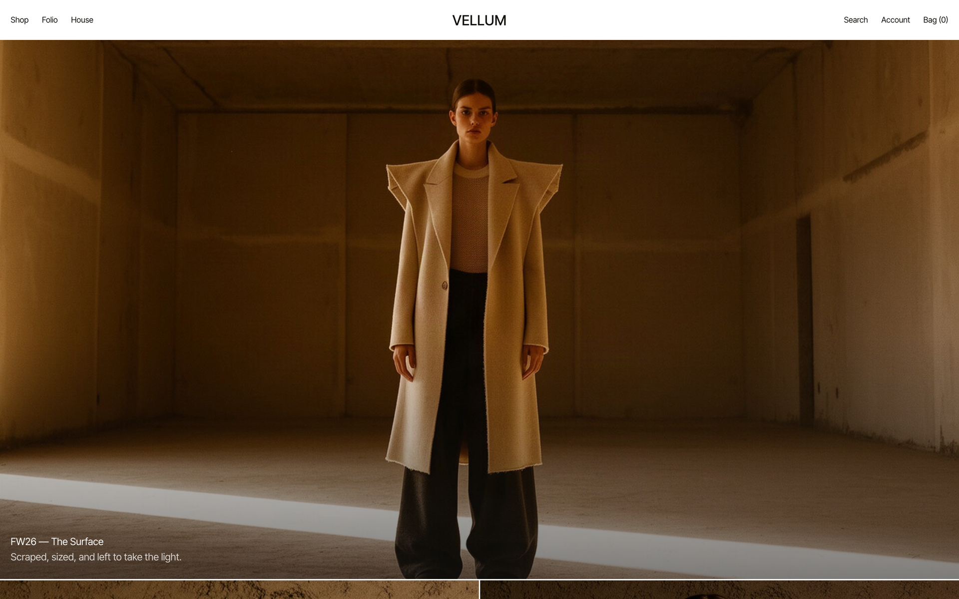
DESCRIPTION
Fashion House — Material-led D2C Commerce
DURATION
Aug 2026 - Sep 2026
MY ROLE
- Brand planning — naming, line structure and a 32-piece catalogue with pricing.
- Design system — a 12px scale, a single accent colour and image-first grid rules.
- Full frontend build — five screens, filter state in the URL, split product detail.
- Visual art direction — 12-model casting, two base frames, 44 frames, normalisation pipeline.
- Identity — mark routes, selection and favicon.
- Cross-browser verification tooling and deployment.
TECH
Vite 5 · React 18 · TypeScript 5 · React Router 6
Generative image production · ImageMagick
Playwright (cross-browser QA) · Node scripts
Vercel
Project Purpose
"A surface is made before anything is written on it." VELLUM is a Milanese house working in genderless ready-to-wear. Vellum is calfskin prepared for writing — stretched on a frame, scraped with a curved blade, rubbed with pumice and chalk over two days before it will take a single mark. The name points at a process rather than a material, and the clothes are made in the same order: cashmere brushed against the grain until the face lifts, wool stone-washed until it abrades, leather tanned with tannin so that it darkens wherever a hand rests.
Background & Challenge
A storefront for a house like this fails the moment the interface competes with the cloth. Everything was decided against one question — how large does the surface of the fabric read on screen. Grid gaps were closed to 2px so the images sit against each other and fill the frame. The image background was matched to the page background so no edge appears between them. Colour was restricted to exactly two places, the product name and the buy button, so the only coloured thing on screen is also the next thing to press.
Scope
- · Brand Planning & 32-Piece Catalogue
- · Design System — 12px Scale, Single Accent
- · Commerce Shell — PLP, Split PDP, Folio Templates
- · Casting & Lookbook Production Pipeline
- · Identity, Cross-Browser Verification & Deployment
Key Technical Features
The Image Is the Layout
- · Grid gaps were closed to 2px so the product images sit against one another and the grid reads as a continuous surface rather than a row of cards.
- · The image background was matched to the page background, so nothing marks where one image ends and the next begins. Images fill their frame rather than sitting inside it, which puts the weave and the nap at the largest size the screen allows.
- · Product name and price sit at opposite ends of one line. On a screen comparing 32 pieces, that lets the eye run down the prices in a single column instead of hunting through stacked text.
Colour in Exactly Two Places
- · The interface is otherwise achromatic. Oxblood appears only on the product name and the buy button, so the coloured thing on screen is always the next thing to press — no separate affordance is needed.
- · Filters are not left open in a sidebar, which would take width away from the images. Categories run along a sub-navigation and the rest fold behind a button on the right.
- · Every filter and sort lives in the query string, so any state is shareable as a link — a category, a line, a colour, a price order.
A Split Product Page
- · The page divides left and right: images scroll on one side while the panel follows on the other. Nothing important leaves the screen as you read down the images.
- · Sizes are laid open as a box grid rather than hidden in a dropdown, with sold-out sizes struck through and left in place, so the available range is legible without a click.
- · Shipping, repair and material care fold into an accordion, which keeps the first screen to only what a purchase decision needs.
Casting on a Cycle
- · Twelve models are assigned to products in rotation, so no face repeats more than three times and any two appearances sit twelve cards apart — exactly three rows down in a four-column grid.
- · Casting frames were produced by replacing only the person in a base frame, so twelve people read as one shoot in one studio.
- · Two base frames were used rather than one — a soft shawl-collar line and a sharp-shouldered raw-cut line — split across the casting so the silhouette never settles into a single note.
Design Points
Closing the Gap Is the Decision
Space between images puts each piece inside a card; removing it lets the whole screen read as one length of cloth. For a house whose subject is material, the second is the right answer, and the text rows carry the breathing room instead.
The Catalogue Is a Glossary
Scraped Cashmere, Palimpsest Cable, Gesso Bouclé, Deckle Edge, Rag Paper Poplin, Marginalia Striped — every product name comes from the vocabulary of manuscript and binding, so scrolling the catalogue tells you what the house cares about.
A Mark Without Letters
The identity mark is three scrape lines rather than an initial. The strokes thin as they go, giving the blade a direction, and the form stays legible at favicon size.
Outcome
- Screens
- 5 (home, shop, product, folio, house)
- Catalogue
- 32 pieces across 5 categories, 3 lines
- Imagery
- 44 frames produced in-house
- Casting
- 12 models, cycled so no face repeats within 12 cards
The visual production and the cross-browser verification both run as scripts, so the catalogue and the QA pass can be regenerated whenever the season changes.
Gallery
Click to enlargeFAQ
How is a 3D interactive website different from a regular one?
It runs Three.js and WebGL in the browser, so objects move and respond to the cursor and scroll. A regular site organises information; an interactive one delivers the brand as an experience. It pays off most in fashion, beauty, architecture and exhibitions.
How long does a website take to build?
Seven days for a landing page, fifteen for a five-page company site, thirty for a ten-page 3D interactive build. The clock starts when your material arrives and shifts with design feedback. If a date is fixed, say so at the first call and feasibility is checked first.
Are hosting, domain and server costs separate?
SSL certificate, hosting setup and database provisioning are included at no cost. You only pay for the domain, about ₩20,000–30,000 a year. Accounts are created in your name from the start, so nothing lapses when staff change.
Can I edit the content myself after launch?
An admin page is built alongside the site, so text, images and posts can be edited without development knowledge, and a manual is handed over at delivery. Only structural changes or new features need development.